
What are rich snippets?
https://blog.hubspot.com/marketing/how-to-use-google-rich-snippets#sm.0001pmo2twti2dxyunx18ji6apicb
What is a sitemap.xml and why do I need one?
A sitemap should be the definitive 'list' or 'index' of all the pages on your website.
The sitemap.xml file is a standard file that is used to tell the search engines all the pages on your site. XML is a file format (like .csv) that provides data in column format.
Why is this important?
Google, and other search engines look to index your site by following links in your site and from external websites. The sitemap is a trusted 'map' followed by search engines that should guide them to every page on the site. Without a sitemap, Google is relying on your site to provide a link to every page on the site.
Without a sitemap you run the risk of 'hiding' pages from Google's index.
The main search engines, including Google, Bing and Yandex offer free 'Webmaster' accounts that will tell you facts about your site, including a count of how many pages they have indexed on your site. They use your sitemap.xml to benchmark the pages indexed on your site. Without the sitemap, you won't have a benchmark of site performance.
How can I create a sitemap?
There are a number of free tools that can help you create a sitemap. Wordpress users have access to a few different tools that will create and publish your sitemap. Take a look at this one, or the bundled tools inAll in One Webmasters or Yoast SEO plugin. You can also use free online tools like https://www.xml-sitemaps.com to create your sitemap. You will then need a techie to upload it to the site.

What is a Robots.txt and why do I need one?
"A robots.txt is a small file that tells a search engine which pages to index and which pages to ignore."
Why is it called a robots.txt?
Every search engine has a spider or robot ('bot) that follows links to find and index pages. Google, Bing, Yandex and Baidu all have their own 'bots that follow links to find new pages. They are constantly seeking new pages to add to their index and rate them to display a search result. When you search, the results you get are from the search engine index, not a fresh trawl or the whole internet.
So the 'robot' part is simply to state this is for the robots to read. The .txt is because it is simply a text file with no formatting.
What does it do?
A robots.txt is written to tell the 'bots which pages, or parts of the websites that should be indexed and which parts should not. A 'good' robot will follow these instructions.
A simple robots.txt should tell the search engine not to index the admin pages, privacy policy and other content you don't wish to be indexed. For new sites in development or sites that just don't want to be indexed, they can be instructed to ignore everything.
Why do I need a robots.txt?
It is good practice to have a Robots.txt on your site so you can have some control over who and what indexes your site, and which parts are indexed.
What does it look like?
A simple robots.txt looks like this.
User-agent: *
Disallow: /wp-admin/
Allow: /wp-admin/admin-ajax.php
This states for any robot (User-agent:*) don't index /wp-admin - that is the front door for editing the site (Disallow), but DO index everything else. Sometimes you can add funny messages as the search engines won't read it. Check out Nike's (below.)
You can see what other sites have included in their robots.txt:
How can I create a robots.txt?
You can create a simple robots.txt with your computer notepad or text pad, or use Google's Robots.txt tool to create and check. You will then need to have it uploaded to your server - ask your techies to fix this, or use a Wordpress plugin to do the heavy lifting.
We check the presence of a robots.txt in every SEO Audit report.
What is a Sitemap | Types of Sitemaps | SEO Sitemap
Sitemap is basically the map that contain information of all located resource on a website. It helps users, as well as search engines, to easily explore a website for their required object. On the other hand it also helps them to improve their search (for user) and indexing experience (for search engines).
What are Different Types of Sitemaps?
There are principally two types of sitemaps;
- HTML sitemap (written in Hypertext Markup Language)
- XML sitemap (written in Extensible Markup Language)
XML Sitemaps can have two types.
- Index Sitemap (how many URL sitemaps a website have)
- URL Sitemap (contain final information of URLs on webpage)
XML sitemaps are further divided into 3 different categories.
- Sitemaps for webpages (commonly known as xml sitemap in community)
- Image sitemaps (details of images and their URLs on website)
- Video sitemaps (what webpages have videos embedded in them and their details)
So, final tree of sitemaps categorization we have is;
- XML Sitemap
- Index Sitemap
- URL Sitemap
- Sitemaps for Webpages
- Sitemaps for Images
- Sitemaps for videos
- HTML Sitemaps
What is an HTML Sitemap?
HTML sitemap, as stated above, is a map that contains information about website resources and their location. These sitemaps are primarily for users to assist them to find their desired item on website or to explore a website easily. Let’s take an example:
A website has thousands of webpage categorized in different sections in form of directories. Now with this massive quantity of webpages user can feel himself at nowhere when he lands on such website. The first thing that can assist him is search option. But if he has no luck then HTML sitemap is the last resort for him where he can explore the website.
Secondly, as HTML sitemap links the resources internally and internal links help in improving keyword rankings; these sitemaps also help linked webpages in their rankings with search engines.
What are XML Sitemaps?
XML is basically a language that store information about an object in organized or pre-defined format. This format is not understandable by humans but search engines do understand what is written in it and the purpose of writing. So, we can say that;
XML sitemaps are primarily for search engines to have a map of internal/external resources of website with their information. Fast and secure indexing of website by search engines rely on these sitemaps.
What do We Write in XML Sitemap?
We write information about objects like its location of availability, importance, type of object, how frequently it gets change etc.
HTML Sitemap
Images Sitemap
Video Sitemap
News Sitemap
Mobile Sitemap
Text Sitemap
About sitemaps
About XML SitemapHTML Sitemap
Images Sitemap
Video Sitemap
News Sitemap
Mobile Sitemap
Text Sitemap
How to Redirect a URL
http://www.wikihow.com/Redirect-a-URL

What Is a Canonical Tag and How Can It Help Your SEO?
What is URL Canonicalization and how to Use Canonical Tag Properly?
I was checking one of the websites I was doing SEO on, and I found that the website had some serious issues related to Canonicalization. I fixed the issues in no time but also decided that I would work on a post for explaining what Canonicalization means and how can one perform Canonicalization of a website properly.
What is URL Canonicalization?
The term Canonicalization can be tough to understand. Let me try to explain this in simple terms.
Let’s say there are two URLs of a website:
http://thewebpage.org
http://www.thewebpage.org
Both of those pages show content, and none of these pages redirects to any one of them. This can result in duplicate content issue on Google, and you can face penalties.
et us see one more example. There are two URLs on a website that result in the same page resolution.
http://thewebpage.org
http://thewebpage.org/index.php
If both of these web pages show the same result, then this might cause an issue as well!
You might not pay much attention to this issue, but this might result in serious duplicate content penalties. The problem with search engine bots is that they can’t decide which version of the URL they should add in their index. If two pages are resolving the same content, they will just assume one copy is a copy of the other and your website will get penalized.
If your site is opening on 2 URLS showing the same content, then you must fix it. You must use server settings so that whether a user opens with www or without www, the site will open on any of the one version. In this way, you can fix the canonicalization.
Though, at times you would like to share same content on two URLS, then you can use rel=”canonical” tags to let search engine know that which is the original and which one is a copy of it. This can save you from duplicate content penalties.
How to correctly apply URL Canonicalization?
Let us now check how to apply URL Canonicalization. We don’t need to type in lines of code to do it. A simple rel=”canonical” tag is enough to apply Canonicalization.
Take an example, there are two URLs on the website that result in the same content when they resolve. These two URLs are:
HTML Canonicalization
The second URL results in the same content as the first URL. They are both displaying the same page and hence you can apply the rel=”canonical” tag, in this case, to indicate that the URL with index.php is a Canonical URL of the first one.
This is how it is applied.
<link rel=”canonical” href=”http://thewebpage.org/index.php”>
HTTP Header Canonicalization
The above markup can be used in the case of HTML content but what if we are dealing with non-HTML content like a PDF document? In those cases, we can use HTTP Header Canonicalization.
> HTTP/1.1 200 OK
> Content-Type: application/pdf
> Link: <http://www.example.com/white-paper.html>; rel=”canonical”
> Content-Length: 785710
> Content-Type: application/pdf
> Link: <http://www.example.com/white-paper.html>; rel=”canonical”
> Content-Length: 785710
You can get more information about HTTP Header based Canonicalization on Google’s official Webmaster blog.
When should you use Canonicalization?
Now that you know what exactly Canonicalization means, you can move forward on the topic and see when should you use it. Because there are many more cases other than the two I have mentioned in the examples above.
Here are a few conditions that can be prevented with proper URL Canonicalization.
These are some major conditions in which we can apply URL Canonicalization to save our site from facing any kind of duplicate content penalty.
This is when you should NOT perform URL Canonicalization!
There are scenarios in which we should not perform URL Canonicalization, and this section of this post is targeted towards specifying these particular conditions. You can also consider these as errors when it comes to URL Canonicalization. Let me list these one by one. I will try to explain most of them in a really simple manner.
Skip pagination canonicalization
If you are planning to canonicalize paginated URLs, then you should know that this is a very bad idea. You should not add a canonicalization tag on the second page of a URL as that URL will not be indexed at all by Google.
Multiple Canonical tags are bad
If a web page has multiple rel=”canonical” tags, then it can be really harmful to you. Make one specific tag and make it clear which one you prefer.
I have seen that many people apply the Canonical tag like this:
<link rel=”canonical” href=”index.php”>
This style of canonicalization is an invitation to a lot of errors. You need to understand that the more complete your canonical markup is, the better it will be for you and your content.
<link rel=”canonical” href=”http://thewebpage.org/index.php”>
The above markup is a better way to apply canonicalization.
Localization means targeting and manipulating the content of the website in order to serve it on the basis of the region it is being viewed in. If you really want to create a better website for your global audience, you can read this guide to create multilingual websites by Google.
Canonicalization on mobile version of websites
Just a canonical tag to differentiate a mobile website on the subdomain of your main website is not enough. Google suggests that you use both rel=”alternate” as well as rel=”canonical” in order to mention that the URL is for displaying the mobile version of the website.
Here is how you can implement it:
> <html>
> <head>
> <link rel=”canonical” href=”http://example.com/” >
> <link rel=”alternate” href=”http://m.example.com/” media=”only screen and (max-width: 640px)”>
> </head>
> <body>
> <head>
> <link rel=”canonical” href=”http://example.com/” >
> <link rel=”alternate” href=”http://m.example.com/” media=”only screen and (max-width: 640px)”>
> </head>
> <body>
Don’t use a Canonical tag outside of <head>
Search engine bots will totally ignore the tags that are set outside the <head> are of the website so in order to apply a proper canonical tag, you need to add it between <head></head>.
Don’t use multiple Canonical tags on a website
Using multiple Canonical tags is pointless. Search engines will ignore both of the tags and you will face weird SEO behavior and issues. Multiple canonical tag URLs are sometimes caused due to plugin glitches so you might have to keep an eye on that.
Don’t point a Canonical URL to a website with a non-200 status code
A website with a code like 301 and 302 will force the search engines to crawl one extra URL and this means that they need to crawl two URLs at once. This adds up to a big amount and it can easily deplete your crawl budget.
A URL with a status code of 404 is a totally wasted crawl and search engines will ignore your tag at all.
Don’t use Canonicalization for PageRank Sculpting
PageRank is no more a public entity or statistic to a website but it is still considered by the search engines. If you are planning to use Canonical tags for PageRank sculpting and to get better ranking, let me make it clear that it will do more harm to your website than good.
Final Word
The concept of onsite SEO is much bigger than what you imagine it to be. You need to take care of many things at once, and you also need to keep yourself updated with the changes that take place in everyday time.
This post was a post for showing how you can apply Canonical URLs on a website. Keep in mind that Canonicalization is a delicate process and if done in a wrong manner, it can harm your website. Keep your website in check and make sure you perform Canonicalization properly.
Sources:
https://webmasters.googleblog.com/2013/04/5-common-mistakes-with-relcanonical.html?m=1)
Optimizing for Mobile - what is mobile friendly optimization -
Mobile optimization is the process of ensuring that visitors who access your site from mobile devices have an experience optimized for the device.
Mobile optimization is the process of ensuring that visitors who access your site from mobile devices have an experience optimized for the device.
What is Mobile Optimization?
Every year people spend more and more time on their mobile devices and tablets, but many websites still aren't designed to account for different screen sizes and load times. Mobile optimization takes a look at site design, site structure, page speed, and more to make sure you're not inadvertently turning mobile visitors away.
Mobile SEO Best Practices
If your site is already well optimized for search engines, there are only a few additional things that you need to think about when optimizing for mobile.
Page speed
Because of hardware and connectivity issues, page speed is even more important for mobile users than desktop users. Beyond optimizing images, you'll want to minify code, leverage browser caching, and reduce redirects. More information on page speed can be found on our SEO Best Practices for Page Speed page.
Don't block CSS, JavaScript, or images
In the old days, some mobile devices couldn't support all of these elements, so webmasters of mobile sites blocked one or all three. But for the most part that's no longer true, and the Smartphone GoogleBot wants to be able to see and categorize the same content that users do. So don't hide it. These elements are also critical to helping Google understand if you have a responsive site or a different mobile solution.
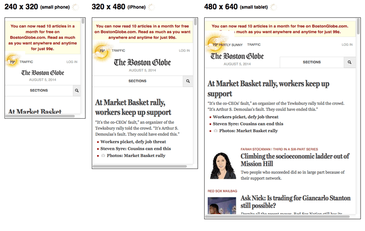
Site design for mobile
Mobile devices are simplifying and revolutionizing the ways sites are designed. "Above the fold" no longer has meaning in a world where we scroll endlessly
Don't use Flash
The plugin may not be available on your user's phone, which means they'll miss out on all the fun. If you want to create special effects, use HTML5 instead.
Don't use pop-ups either
It can be difficult and frustrating to try and close these on a mobile device. This might lead to a high bounce rate.
Design for the fat finger
Touch screen navigation can lead to accidental clicks if your buttons are too big, too small, or in the path of a finger that's trying to get the page to scroll.
Optimize titles and meta descriptions
Remember that you're working with less screen space when a user searches using a mobile device. To show off your best work in SERPS, be as concise as possible (without sacrificing the quality of the information) when creating titles, URLs, and meta descriptions.
Use Schema.org structured data
Because of the limited screen space, a search result with rich snippets is even more likely to stand out than on a desktop. Read more about Schema.org structured data.
Optimize for local search
If your business has a local element, remember to optimize your mobile content for local search. This includes standardizing your name, address, and phone number and including your city and state name in your site's metadata. More information on local SEO can be found here.
Mobile site configuration
Probably the most important decision you'll make when setting up a site is deciding whether you want to use a responsive, dynamic serving, or separate site configuration. Each has its advantages and disadvantages. Google prefers responsive design but supports all three options as long as you have set them up properly.
Responsive web design
Responsively-designed sites use CSS3 media queries to serve the same content to mobile and desktop users using a fluid grid and a flexible design to automatically adapt to the size of a user's screen.
Responsive designs use media queries to target the layout based on screen width, orientation, and resolution. For example, you could use the following CSS to instruct browsers how to display content for a screen that's 420 or fewer pixels wide:
Code Sample
@media screen and (max-width: 420px) {
  .class {
    [styles for this class here]
  }
}
And to link to a separate stylesheet instead, put the following HTML in between your
<head> tags:Code Sample
<link href="mobile.css" type="text/css" media="screen and (max-device-width: 480px)" rel="stylesheet"/>
Responsive designs allow you to have a variety of these media queries so that users on tiny mobile screens, larger-than-average mobile screens, and even tablets can all see a site that looks designed for their devices.
Use an emulator like the Responsive Web Design Testing Tool to verify that your responsive design looks the way you want it to.
Dynamic serving
If you don't have the resources for a complete site redesign or want to display different content for mobile visitors than you do for desktop ones, one solution is to use one URL to display different sets of HTML and CSS depending on what type of device your visitor is using (also called detecting user agents). This can be useful, for example, if you're a restaurant who wants a mobile visitor (who might be wandering your neighborhood) to see a sampling of reviews and a map to your location instead of your full website.
Displaying different content based on the user agent is called dynamic serving and it's done using the Vary HTTP header, which looks like this:
Vary HTTP Header
GET /page-1 HTTP/1.1
Host: www.example.com
(...rest of HTTP request headers...)
HTTP/1.1 200 OK
Content-Type: text/html
Vary: User-Agent
Content-Length: 5710
(... rest of HTTP response headers...)
Example from the Google Developers Blog.
Simply put, this means that the content displayed will vary based on the user agent requesting the page.
Dynamic serving is not the perfect compromise that it might seem to be. For one, it relies on having an updated list of user agents, which means that every time a new mobile device comes to market that list needs to be updated. And it's not uncommon for desktops and mobile devices to be wrongly served with the HTML for the other device. Read more about common pitfalls.
Separate mobile URL
Another option is to create a second, parallel site for mobile users. This allows you to create completely custom content for mobile visitors. To avoid URL confusion, most parallel mobile sites use an "m" subdomain.
Parallel mobile sites can be as imperfect as dynamic serving sites at sending visitors to the right version, so be sure to make it easy for visitors who end up in the wrong place to click over to their preferred experience.
You'll also want to make sure that your site redirects are all in place and as lean as possible to decrease page speed. And to avoid duplicate content issues, you'll need to set up rel="canonical".
What about using an app?
Creating an app is one way to tailor the mobile experience for your visitors. But the interstitial page many sites use to alert a mobile user that an app is available can also serve as a block to search engine crawlers. Google's John Mueller explains.
Related Tools
- Mobile Emulator
This tool lets you see what your site looks like on a wide variety of mobile devices. - Moz Local
Make sure that your local SEO is in order with this tool from Moz. - MozBar
Double-check your structured data markup and redirects with this toolbar from Moz. - Responsive Web Design Testing Tool
See what your responsive site looks like on a variety of standard screen sizes. - Screaming Frog
Check your redirects by analyzing your site with this tool. - User Agent Switcher
This Firefox add-on lets you see what your site looks like when accessed from a different user agent.
External Resources
- Building Smartphone-Optimized Websites
Official advice from Google on how to get your mobile site in order.
Related Guides
- The SEO's Guide to Building a Great Mobile Site
Kristina Kledzik lays out why you need a mobile solution now and offers insight into what options work best for different types of sites. - The Definitive Guide to Google's New Mobile SEO Rules
Peter McLachlan outlines what Google is looking for in a mobile-optimized site. - Good Practices to Maximize Your Mobile SEO
In this Mozinar, Aleyda Solis shows you how to determine whether it's time to optimize your site for mobile and gives insight into the pros and cons of various setups.

what is schema in seo - How to Boost Your SEO by Using Schema Markup
What is Schema?
Schema is a type of microdata that makes it easier for search engines to parse and interpret the information on your web pages more effectively so they can serve relevant results to users based on search queries.
What is Schema.org?
Schema.org is the centralized home on the web for the Schema project, a collaboration between Google, Bing, Yahoo! and Russian search engine Yandex (the one trying out search without links) to standardize structured markup
How Does Schema Work?
As with other markup formats, schema microdata is applied to the content of a page to define exactly what it is and how it should be treated. Schema elements and attributes can be added directly to the HTML code of a web page to provide the search engines’ crawlers with additional information.
In the example below from schema.org, which focuses on content about James Cameron’s 2009 movie, “Avatar”, you can see that adding the itemtype attribute to the relevant <div> block makes it easier for search engines to identify that this content relates to a movie, as defined by the schema.org type hierarchy. Similarly, the addition of the itemscope attribute specifies that everything contained in that particular <div> block references a specific item – in this case, James Cameron’s $237 million remake of “Fern Gully.”
Let’s look at another example from schema.org:

Times and dates can be very difficult for search engines to interpret correctly. This is due to differences in how dates are formatted, whether the event in question took place in the past or is scheduled to occur in the future, and the fact that search engines (like all computers) are actually pretty stupid. In this example, the inclusion of the Event itemtype attribute makes it clear that this is an event taking place on a specific date (as you can see by the addition of the startDate and datetime attributes), making it easier for search engines to return relevant results to the user. This eliminates any ambiguity for users searching for information about the 1984 film of the same name, which is arguably one of the finest movies ever made. Unlike “Avatar.”
Can Schema Improve SEO?
Including schema microdata in your HTML code can help search engine crawlers interpret the content of your pages more effectively. This, in turn, can increase your visibility. However, it’s important to note that including schema (or any other structured markup format) in your code is not a quick and dirty SEO “hack” – instead, think of schema as a best practice to make it easier for search engines to find and display your content.
Does Schema Improve Search Rankings?
No, not at this time. Google claims that the inclusion of schema microdata is not currently used as a ranking signal. However, it does improve your site’s rich snippets, which can help your site appear more prominently in SERPs.
What Else Can Schema Do for Me?
Aside from making it easier for search engines to properly categorize your site’s content, marking up your pages with schema microdata can also be used to define and display rich snippets of your content in SERPs. Contrary to common misconception, Google does, in fact, use schema markup to display rich snippets. Clear, concise rich snippets can result in higher click-through rates, as users can quickly and easily determine whether the content on your site is what they’re looking for.


Source:
http://www.wordstream.com/blog/ws/2014/03/20/schema-seo
Schema is a type of microdata that makes it easier for search engines to parse and interpret the information on your web pages more effectively so they can serve relevant results to users based on search queries.
What is Schema.org?
Schema.org is the centralized home on the web for the Schema project, a collaboration between Google, Bing, Yahoo! and Russian search engine Yandex (the one trying out search without links) to standardize structured markup
How Does Schema Work?
As with other markup formats, schema microdata is applied to the content of a page to define exactly what it is and how it should be treated. Schema elements and attributes can be added directly to the HTML code of a web page to provide the search engines’ crawlers with additional information.
In the example below from schema.org, which focuses on content about James Cameron’s 2009 movie, “Avatar”, you can see that adding the itemtype attribute to the relevant <div> block makes it easier for search engines to identify that this content relates to a movie, as defined by the schema.org type hierarchy. Similarly, the addition of the itemscope attribute specifies that everything contained in that particular <div> block references a specific item – in this case, James Cameron’s $237 million remake of “Fern Gully.”
Let’s look at another example from schema.org:
Times and dates can be very difficult for search engines to interpret correctly. This is due to differences in how dates are formatted, whether the event in question took place in the past or is scheduled to occur in the future, and the fact that search engines (like all computers) are actually pretty stupid. In this example, the inclusion of the Event itemtype attribute makes it clear that this is an event taking place on a specific date (as you can see by the addition of the startDate and datetime attributes), making it easier for search engines to return relevant results to the user. This eliminates any ambiguity for users searching for information about the 1984 film of the same name, which is arguably one of the finest movies ever made. Unlike “Avatar.”
Can Schema Improve SEO?
Including schema microdata in your HTML code can help search engine crawlers interpret the content of your pages more effectively. This, in turn, can increase your visibility. However, it’s important to note that including schema (or any other structured markup format) in your code is not a quick and dirty SEO “hack” – instead, think of schema as a best practice to make it easier for search engines to find and display your content.
Does Schema Improve Search Rankings?
No, not at this time. Google claims that the inclusion of schema microdata is not currently used as a ranking signal. However, it does improve your site’s rich snippets, which can help your site appear more prominently in SERPs.
What Else Can Schema Do for Me?
Aside from making it easier for search engines to properly categorize your site’s content, marking up your pages with schema microdata can also be used to define and display rich snippets of your content in SERPs. Contrary to common misconception, Google does, in fact, use schema markup to display rich snippets. Clear, concise rich snippets can result in higher click-through rates, as users can quickly and easily determine whether the content on your site is what they’re looking for.
How Do I Markup My Pages with Schema Microdata?
Okay, I’ll level with you – marking up your pages with schema microdata can be kind of a pain, especially if your site has hundreds (or thousands) of pages. The markup has to be added manually to each page, which is a lot of work for larger sites. However, if you’re still in the planning stages or have a smaller site (lucky you), then adding schema microdata will be less hassle. Follow the steps outlined in this guide to get started. Once you’re satisfied with your markup, use Google’s Structured Data Testing Tool to check that everything is working correctly.
Do I Have to Markup Every Property on Every Page?
No, but the more properties you apply schema microdata to, the clearer the nature and purpose of your site’s content will be to the search engines. Also, it’s worth remembering that you have to apply schema markup to a certain number of properties before Google can create rich snippets using your microdata. You can check what information can be extracted from your markup using Google’s Structured Data Testing Tool.
What About Facebook Open Graph and Twitter Cards?
Some marketers mistakenly believe that including Open Graph tags (and Twitter Cards, to a lesser extent) is all they need to do to ensure that their content is as shareable as possible. However, schema microdata can be used in conjunction with social media tags to provide search engines with even more detail about a page’s content. Include schema markup alongside your Open Graph tags to make your content shareable and highly optimized.
Does Schema Support Other Markup Data Types?
Yes. When Google announced the schema.org project, a lot of webmasters were dismayed to learn that information types supported by other structured markup formats weren’t compatible with schema microdata. Google listened, and now schema plays nice with data types featured in RDFa and other formats.
Can I Add to the Schema Vocabulary?
Kind of. Schema’s type hierarchy contains many commonly used item types. Most have relevant subtypes, but the extent of these subtypes can vary. In some cases, you might want to add your own item types to your markup. You can do this by using extensions. To create a custom item type, simply add a slash at the end of an existing item type, and enter the new term.
Person/Engineer/ElectricalEngineer
In the example above,
Person is the existing itemtype, while Engineer and ElectricalEngineer are the custom item types. Details about naming conventions and extending existing properties, classes and enumerated items can be found on schema.org.http://www.wordstream.com/blog/ws/2014/03/20/schema-seo
Subscribe to:
Posts (Atom)